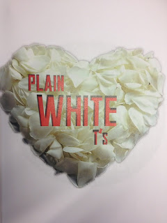
This is our final logo that will be used over all of our promotional packages. We liked our first logo idea, the way the petals had formed a love heart reflecting the genre. However because we had started to use a rose on our digi pack front covers, we felt that instead of rose petals we should use roses,still keeping the shape of a heart. The original colour of the love heart was a bland pastel red however through contrasting I made it brighter and therefore the shadows stood out more. This meant that I could include the black and red colour scheme running through out my promotional package.We decided to change the font so that it matched our final ' Plain White T's' font used on throughout our tasks, this being Richard. However our text is usually black but this wouldn't stand out against the black and red logo so we used the colour white as we had already scene from our first logo idea how well red and white help each other to stand out.
As a group we created a few logos on photoshop that would be a common motif throughout the whole promotional package. We needed our logos to represent the genre and the band, the genre of Plain White T's songs are generally about love and heartache. Romantic stereotypes are the receiving of roses, sitting under the sunset together, kissing in the rain and obviously the heart shape. We experimented with these elements and created the following logos:
Logo Idea 1
This logo represent white rose petals which represent innocence and purity. The use of a red text matches the colour scheme and means that it will stand out as the colours are contrasting. The word 'white' is in capitals because it is completley opposite to the colour the text is actually in. The rose petals are shaped in a heart to reflect the romantic genre of the music. The text has a black drop shadow to create a 3D effect and to once again match the colour scheme.
Logo Idea 2
The idea of the logo being in a circle makes it look more attractive as it has shaping to iut however it also represents the shape of the sun which is the theme within this logo. Having a tree which insinuates it is in a forest is romantic as couples go for romantic walks or have picnics in the park. The sunset is a common element as a stereotyped romantic scene is a couple sitting together under the sunset as it goes down. The text 'Plain White t's has a black glow around it which reflects the glow of the sun. Luckily the tree is situated to the left which means that the text can be on the right without layering over any important elements of the image.
Reception theory is based on the idea that no text has one single meaning rather the meaning is produced as a result of interaction between the audience and the text. Reception theorists suggest factors such as gender, social status, and social context are every important when we construct a meaning for a text. In 1980 David Morley undertook a study based on different peoples reception of the television programme nationwide. He discovered 3 main types of reading:
Dominant (hegemonic) reading- reader shares the programmes code and accepts the preferred reading.
Negotiated Reading- the reader partly shares the programmes code but modifies it in a way which reflects their position and interests.
Oppositional reading- the reader does not share the programmes code and rejects the preferred reading bringing to bear an alternative frame of interpretation.
As previously stated we chose our font for the band name and the album name to be the same. However in order to differentiate them from each other, we decided to add effects, shapes and change the sizing for it to stand out to become their trade mark style for the band name.
We chose to emphasise the 'P' by making it larger and longer in order to create levels to the name, we felt that this would make it stand out and attractive to the audience, this added a different dimension to it. Because the first letter was larger than the rest, we decided to put the last letter smaller than the rest as well. Because we had a red and black colour scheme throughout our promotional package we wanted to incorporate it into our final band name logo, we thought that red would represent the romantic genre and stand out to an audience as black and red are contrasting. The use of these red long lines, creates a modern edgy effect to it and also creates layering as it is placed behind the 'P' so that attention isn't taken off the band name. We also didn't chose to extend the red lines the whole way as we wanted to break normal conventions and when asking members of the class they said it looked too formal, we also showed them it with only one red line and they felt that it looked odd and pointless.
Below is the video of our pitch which we had to present to our media A-level teachers before we was allowed to continue with the production of our project:
As part of our footage was decided that we would need the use of a train station, me and my group needed to gain permission to film at the station itself. Due to this we decided to create a letter which would we could send to the train company to let them know about the use of the station, what it was for and what we would be carrying/using. As London Bridge station is a station that is used by thousands every day it is necessary to gain this permission for security and safety reasons.
Below is the letter that was created and sent to National Rail Enquiries:
As part of the project we had been set the task as to use piece of music to create a music video. In order to do this we had to gain the permission of a record label to state that we would only be using the sound track for 'Studying Purposes' and not in any form to produce profit.
To do this we decided as a group that we would produce a letter stating all of the facts which we could then send off to the record label for there acknowledgement. This letter was sent to Hollywood Records Inc. Below is the letter that we sent:
I have now evaluated three videos by bands associated with the 'Pop-Rock' genre. In this post I am going to explain what features from the videos I evaluated that I shall incorporate into my music video due to there effectiveness. I will also be explaining the conventions that I have found that run through out the sub genre. This will include camera shots, angles, lighting, editing and clothing.
Camera Shots
The use of close-ups, whether this be for members of the band or on instruments themselves was an a common convention used throughout the music videos of this genre and I will try to apply this to my camera work when filming. Panning shots of the band whilst they are playing there instruments and performing is also a common convention used through the genre/sub-genre. Many shots that I will also try to incorporate into the groups footage is high and low angle shots, over the shoulder shots, mid and long shots.
Lighting
Low Lighting is used often throughout the videos as it representative of the genre. I will try to apply this when filming, although it will be difficult due to some of the day light shooting, for the band shots I believe it will be crucial to try and get these shots at night when it is possible to use low lighting.
Editing
One feature that was consistent throughout the three videos and that I will try to incorporate into the editing that me and my group will do is 'Parallel Editing'. This is due to the effectiveness of the ability to have a narrative whilst also showing the band members performing the song.
Clothing
As for clothing we must wear clothes that fit the genre/sub genre so that we fit the target audiences wants and needs. Therefore wearing things such as skinny jeans, 'Beenie' hats, shirts and baggy tops as seen throughout the three videos would be suitable. Also a lot of black clothing was using to represent the feelings of the videos so this would also be a feature to use when filming.
The opening shot is what seems to look like the back of someone sawing something. This an an odd use of a first shot as it does not give the audience any leads on what is going on. This is also an effective yet obscure shot as it would intrugue the audience.
This then moves to close-ups and panning shots of the band. These are effective and are a commen convention used throughout the 'Pop-Rock' genre as the audiences like to see the band members with the iconic clothing through the application of gaze theory.
One of the more intrueging and effective shots from the video camera is a shot of close-ups of the band members playing there instruments such as a close up of the sticks on the drums or the guitarist playing the there guitars.
Evaluation Video Two - You Me At Six - No One Does It Better
The opening scene is an establishing shot showing that the band are in the middle of the desert. In the background there is a song being played quietly. It the next shot of an over the shoulder shot of the band members in the car it becomes apparent that the song is being played on the radio.
The band members are wearing clothes that fit the genre and the iconic as they are of dark colours and represent sadness and the song itself. Slow motion but with short clips that flick to another quickly. I believe this has been used throughout the video as it states the mood of the song being that of a sad and slow song but the quickness in which the events have happened.
The music video uses obscure close ups of objects such as a horse riding into the desert. A shot from the inside of an abandoned shop/house and of a single dead tree in the desert. All of these shot seem at first to have no relation to the video but with an in depth anaylsis it becomes evident that they are relavent and represent certain emotions such as 'lonliness'.
Evaluation Video One - The Script - If You Ever Come Back
The very first piece of footage shownn is of a close up of a girl who looks as though she is sad which fits the representation of the sub genre that I produced originaly. It then moves onto an establishing shot with the an underground sign of 'West Acton'.
The next shot used of an effective tracking shot of the band. The band are wearing dark clothes that looks 'Smart-Casual'. I believe that this is representative of the meaning of the song and represents the sadness throughout the song.
The next effective shot is of a girl on a platform watching the train go past her. This links up with the lyrics 'but you can't step on the train'. The music video uses parralel editing to draw a story whilst also showing the band sing/playing the song.
The video uses some obscure shots of things such as close-ups of her hair, lips, a boiling pot and a cat. I believe these shots are effective as they represent different parts of the song whilst also intrueging the audience. Another effect used is shallow focus which is used on some shot showing sun shining through and blurs the character out.
The song does not use many bright colours. Most of the colours used are of of dark gloomy colours such as browns and blacks. This includes the lighting used. The lighting is all dark apart from one scene that has snow which I believe is there to represent the purity of the girl actor.
Features That Will Influence My Tour Date Advert/ Album Advert
I have now evaluated three Tour Date Adverts by bands associated with the 'Pop-Rock' genre. In this post I am going to explain what features from the adverts I evaluated that I shall incorporate into my music video due to there effectiveness. I will also be explaining the conventions that I have found that run through out the sub genre. This will include use of logo, gaze theory, graphics, colours and spread of information.
Use of Logo
One of the common conventions I have found when looking at tour date adverts is the use of the band logo in a big font size. This is effective as it instantly gives the audience of the knowledge of what the advert is for and will lead them into reading further. I will try to incorporate this into the advert that I am going to make.
Gaze Theory
A common convention applied is the use of gaze theory through displaying the band members. I will try to incorporate this into my designs by having the people who I am using for band members looking straight at the camera and wearing the correct clothing to attract the audience.
Graphics
The use of graphics is an attractive feature that I will try to use when designing and developing my drafts and final piece. I will use graphics as they are common feature found through the genre/sub-genre, used to attract and intrigue and audience into reading the full advert.
Colours
Influences that I will take in terms of colour is to use dark and dull colours for the background, contrasting colours for the copy and masthead . I will also try to apply the colour red as it is not only the motif within the video but also representative of the genre, that being to do with love.
Spread of Information
It is crucial to include the sufficient information that a tour date advert includes. These are things such as all the dates of the tours (including headers that state the month), the phone number of the venue, what the actual venue is and the name of the tour. One other key convention that I did notice was the advertisement of 'AND SPECIAL GUESTS' I believe incorporating this will be crucial when gaining the attention of the audience.
As one of my ancillary tasks that I decieded to create was a 'Tour Date Advert' it was nessicary to conduct some research into three real adverts that were within the same genre/sub-genre to the 'Plain White T's' so that I could understand the code and conventions, how they should be presented and the content of a tour date advert. Below are the three tour date adverts that I anaylized:
These are the story board plans that we made for the chorus. we have linked each scene to a certain section of the lyrics and described the camera shot in which we shall use and the location of the shot. These shall be used whilst filming to direct us and let us know which shots we need to take.